With an eye for design and a steady stream of likable images, architects, remodelers and home builders have emerged as strong players on Instagram, using the platform to drive traffic to their websites and create a buzz where they live and work.
“My own growth was exponential because of Instagram because I was able to reach a broader audience,” said Jen Laurens, the Philly based designer behind Tiny Anchor Studios.
Though Laurens primarily works in Pennsylvania and New Jersey, one of her current clients is in Chicago. The client was a referral but the contractor, the cabinet maker, and even the guy making the floating shelves, came from social media connections. “The whole job could be dialed back to Instagram. When I got the job I followed a contractor in Chicago and he followed me and I said, ‘Think we can make this work?'” And together they have been doing an entire condo reno together.
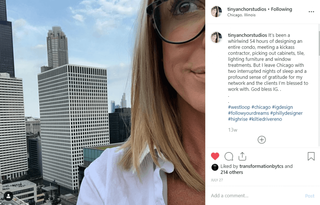
Laurens says one of the things she loves about Instagram is that it gives her a platform to show her process and speak to her audience authentically, more than platforms like Houzz which she notes are two dimensional.
“It’s more insightful. I don’t talk a lot on Instagram, it’s mostly pictures of tiles and designs, but when I do, I speak from the heart, and when I meet people they say, ‘You’re exactly how I thought you be,'” she said. “So when I go to their home they already know my style. They know how I work. They know what they’re getting, which just helps my cause.”
“Instagram is the best online resume you could ask for,” said Laurens.
Building that online resume isn’t intuitive for everyone, but there are some simple guidelines and best practices that any designer or remodeler can apply to their business.
If you’re on Insta and want to use it to drive more business, read on because today we’re going to cover how to get noticed on the platform.
In our work for building product brands, we’ve found that the most successful business accounts follow these six best practices on Instagram.
They each:
- Engage with the audience and create a culture around their company or personal brand
- Focus on their target audience, not their company
- Stay consistent by staying true to their message
- Use professional photography and video when possible
- Have a hashtag strategy
- Review Instagram insights and pivot when needed
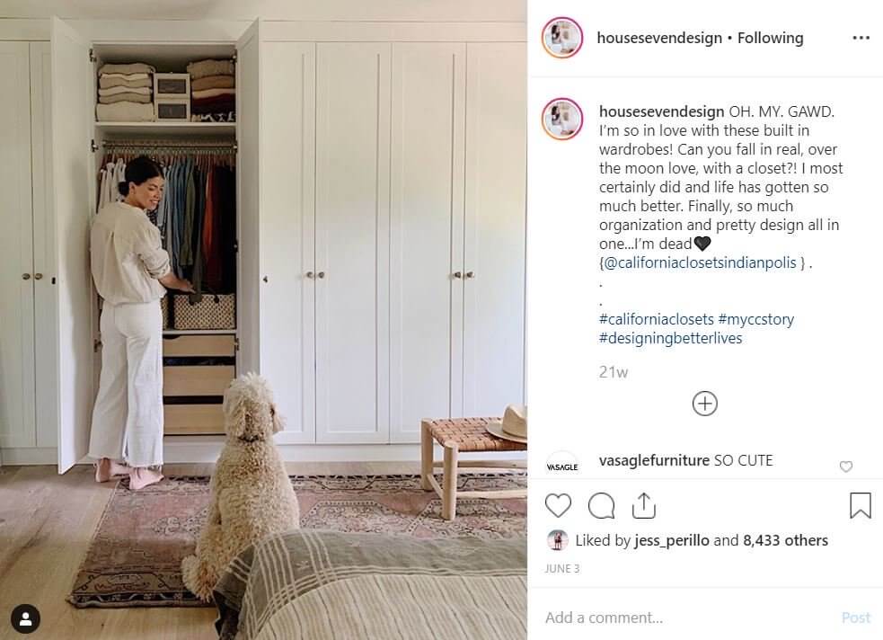
House Seven Design (a UV influencer partner) is on a steady rise in Indianapolis where the husband and wife design and remodel team live and work, often using their home and their IG as a lab for product partnerships.
Optimize your profile for your audience
Before they become fans and followers, users will check out your profile as a litmus test of your relevance to their needs.
You can set yourself apart from competitors with three points of distinction:
- Geography
- Style
- Expertise and awards
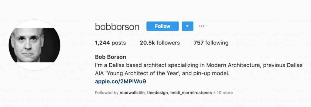
See this example from Bob Borson, an architect and influencer. He’s hits all the points: Dallas, modern and Young Architect of the Year. And because he’s Bob, the magic point 4: humor. If being cheeky fits your personality and your brand, go for it.
Keep your feed lively and relevant
Posting beautiful pictures is important to generate a following, but it’s not the only driver of followers and engagement. We’ve found a direct correlation between a company’s engagement and their ability to capture and share images of their own work. Even pretty pictures can feel sterile when there isn’t an authentic connection to your work, your team or your community.
Our favorite architect, builder and designer accounts all:
- Cultivate a connection to their location
- Showcase their points of difference from competitors
- Get personal
- Have a sense of humor
- Feature their skills and expertise
- Give a behind-the-scenes look into the work and process
A few examples:
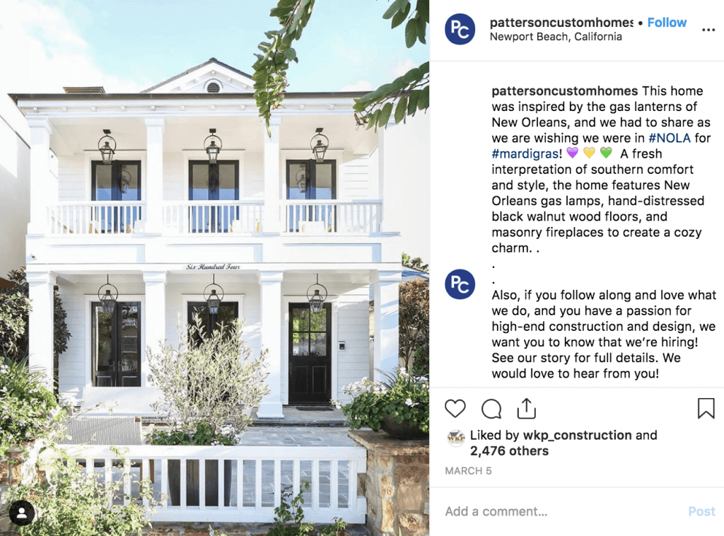
Patterson Custom Homes in Newport Beach, California uses their images to connect with history, locale and style.
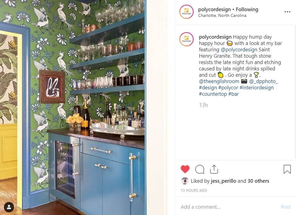
Polycor, a quarrier of natural stone for countertops, works with designers like Holly Hollingsworth of The English Room to showcase how its products hold up in real life.
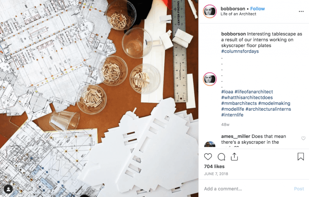
Architect Bob Borson gives a behind-the-scenes glimpse that’s both artful and indicative of a hard working office with big projects.
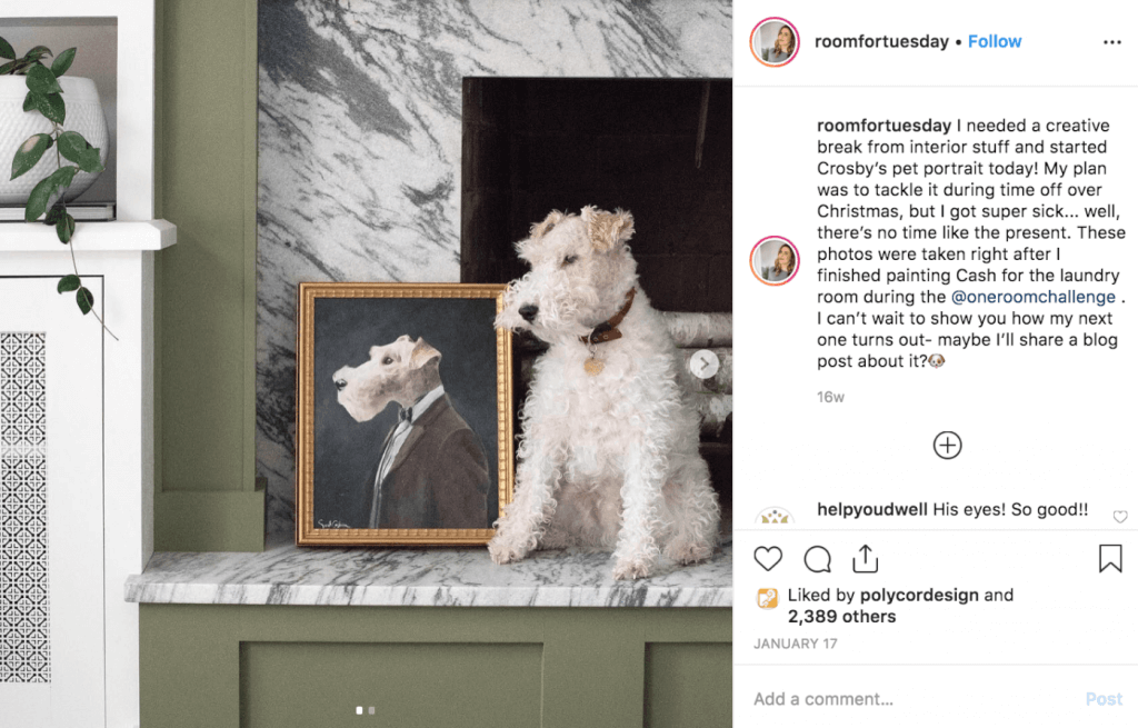
Blogger and design-build professional Sarah Gibson has created a personable voice for her account Room For Tuesday by regularly sharing her handsome pets. Even if your audience is full of cat people, they’ll love the (occasional) cameo from your good dog.
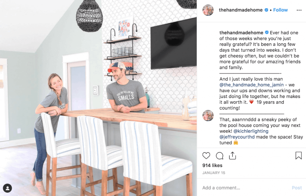
The husband and wife duo behind The Handmade Home are humble and approachable, and that endears them to their audience. Who wouldn’t want to hire a design-build team that’s both talented and grateful?
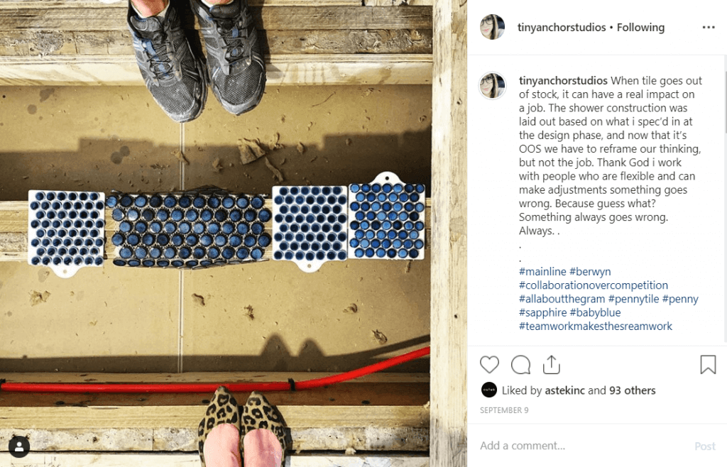
Jen Laurens from Tiny Anchor Studios uses her account to highlight her design process and the work of her expert contractors who bring it to life – even (and especially) when the job doesn’t go as planned. (I think you can guess which shoes belong to Laurens.)
Craft a consistent look on your feed
Think of your feed as a series of 12 panel art installations. Each post should stand on its own for attractiveness and relevance, AND it should be part of a cohesive look.
Check out Tiny House Basics’ feed. It features a consistent palette of colors – soft blue, green and earth tones – and a nice mix of installation and people images.
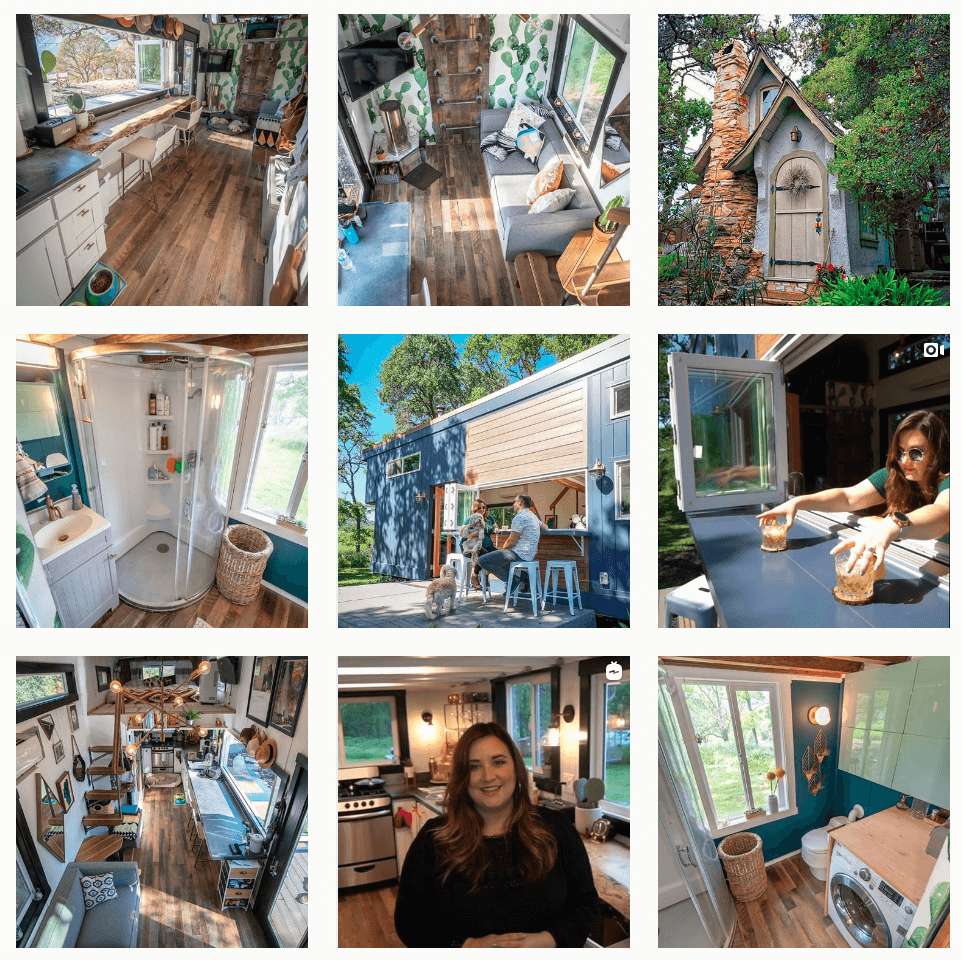
The simplest way to do this is to plan your posts a month out. You can Rubik’s Cube the images around in your gallery until you’ve created a layout that’s balanced (we suggest the Preview app). And if you’re using a filter, stick to one for consistency.
But what about those not-so-pretty process pics? That’s where Instagram Stories come in.
If you’re onsite for demo day, you’ve got a great opportunity to let your audience go behind-the-scenes of one of your projects. Audiences love getting a glimpse behind the curtain to see the wizard at work. But those images of busted sheetrock and ugly before kitchens don’t look awesome on a feed.
Let IG Stories be your home for everything from demo to install days and all the trials and triumphs along the way.
