The ebook is an effective (though basic) lead nurturing offer. It delivers valuable info to contacts and is great for search authority. It’s also a bit of a yawn. So many words.
For our clients in design build we find that the ebook’s younger, better looking cousin, the lookbook gets more attention (and more lead captures). Designing one is easy, and a great way to repurpose those images you spent so much money on for your product catalog and website.
A product lookbook is a collection of images and copy put together to showcase a company’s product, whether it be in the form of a inspiration guide or case study.
Before you design it, map it
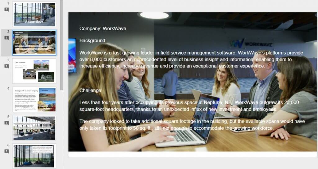
First things first: write the copy and choose the photos — then, lay it all out. A simple way to come up with your lookbook layout is to create a mock-up in PowerPoint or Google Slides. Spend absolutely no time on making it look pretty — your designer can focus on that later. This is just a helpful way to develop the concept and figure out placement. (It’s also the best way to see what you’re missing.)
Here is an example of a mock-up for a case study lookbook created in Google Slides.
Use high quality photos only
High quality photos are of the utmost importance when it comes to a digital product lookbook — after all, they are the center of attention. One blurry photo will make your brand look like an amateur. So what constitutes a high quality photo?
Higher resolution photography means higher image quality. The sharpness, definition and detail go up alongside the photo resolution. The more pixels, the better the photo resolution. Lighting and a correct exposure are also other factors that make a high quality photo. You can always adjust lighting and color with photography software, such as Photoshop or Lightroom.
Here are three reasons why you need clear, well-focused images at a high resolution.
- If your photos appear blurry or pixelated, you won’t be showing the best version of your product.
- If you need to use an entire photo for one page or spread it across two pages the enlargement won’t create a drop in quality.
- The same concept goes for zooming and cropping. If you need to focus on one specific part of a photo, a high resolution photo gives your a little playroom and the photo quality will remain the same.

This is a high quality photo (4851 x 3435 pixels, 96 dpi)

Zoomed and cropped, this is what it looks like (still crisp and clear).

When the image size is lowered to 800 x 566 pixels, this is what it looks like when zoomed and cropped (blurry and pixelated).
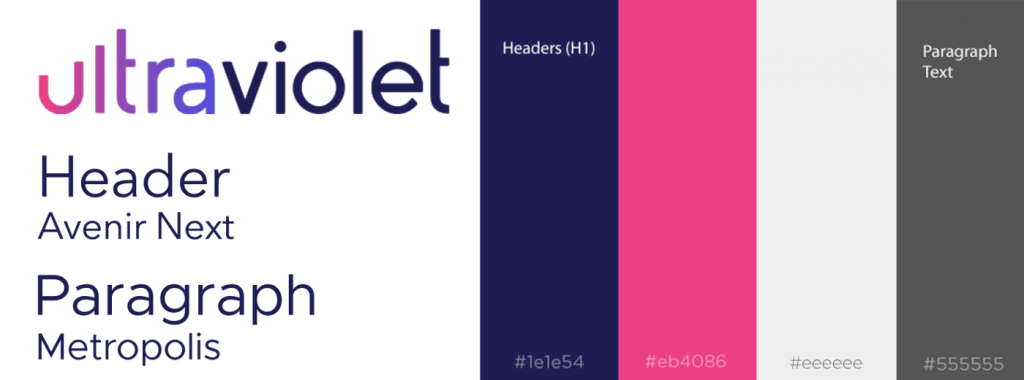
Consult the brand guidelines
A company’s brand guidelines are essentially the visual DNA of its branding. The information found in these guidelines include the specifications for use of the logo, colors, sub colors, color palette, typography and icons.
While designing, consult the guidelines in order to keep a consistent look with the branding. Here’s our branding. Isn’t it pretty?
Judge the book by it’s cover
People will most definitely be judging your lookbook by its cover, so keep that in mind when designing. It should be visually appealing, while coinciding with your brand guidelines.
Here are some lookbook cover design essentials.
- Make the title easy to read, and relevant to ebook.
- Keep it simple by limiting text.
- Feature a relevant image.
- Include branding elements: logo, tagline, colors and font.
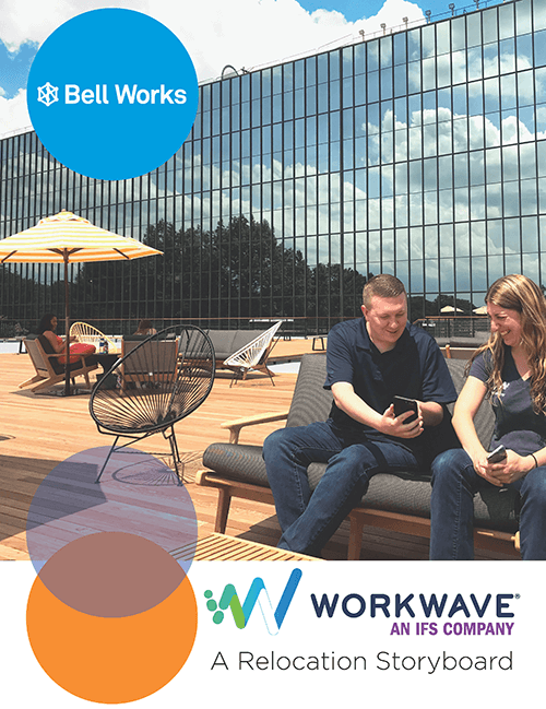
We designed the ebook above to tell the relocation story of a tech company who is now a tenant of the metroburb Bell Works (also our agency’s home). Partly a case study of their decision to move here and partly a lookbook of WorkWave’s swank offices and gorgeous surroundings, we chose to call it a Relocation Storyboard. Click here to download it.
On this cover you see the brand’s logo, the signature overlapping circles in one of the brand’s color palettes, an easy-to-read title in the header font and a relevant image.
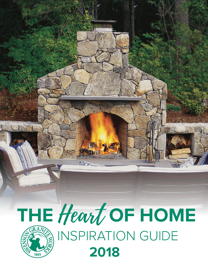
Consider a strong focal point that will help your viewers’ eyes naturally settle on the important pieces of the design first.
For example, the focal point of this inspiration guide cover, designed for the natural stone supplier Swenson Granite Works, is the flame of the fireplace. It has been placed centrally, drawing attention toward the glow and the surrounding stone, then the fading image directs the eye down toward more information. The image is an appropriate representation of what this product lookbook is all about — fireplaces and fire pits. Click here to see it for yourself.
Be clear about what you’re offering
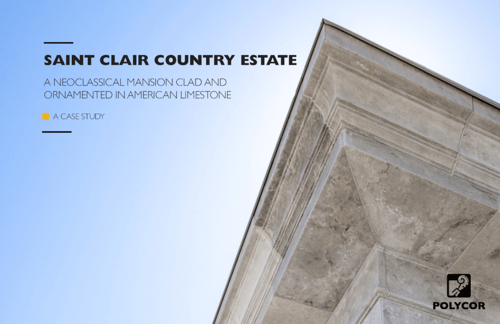
This case study / lookbook cover, designed for the natural stone quarrier Polycor, takes advantage of the open space on the left of the page to place the title. The pillar’s point on the top right acts as a focal point, directing the viewers’ eyes to the title next to it.
The headline and subhead follow a simple formula for communicating to the reader what the offer is (and who it’s for). Subject + simple description + offer type. The subject includes the product’s name: Saint Clair. The description in the subhead includes an explanation of the product: American limestone. The offer type – case study – makes it clear that the reader is going to get an in-depth look at a project (versus a catalog, spec sheet, etc.) Click here to see the case study.
If you find yourself struggling to come up with a creative title, go instead with something clear and obvious. Sometimes when we fall in love with our own snappy titles we forget that the reader has no idea what we’re selling. If it’s a lookbook about flush mount lighting fixtures, it’s ok to say just that.
Get viewers to take action
With a call to action (CTA), you will prompt your viewers to take action after they’ve read your lookbook. Consider including a CTA on the last page if appropriate.
Here are some some tips for creating that last page that gets viewers to take action.
- Include either a simple headline and button, or a headline, message and button.
- Make it clear what will happen when the viewer clicks on the CTA button. Rather than saying “click here” say “speak to a rep” or “talk to us today.”
- The button design is just as important as the words — choose a color that contrasts the background color (light button with a dark background, dark button with a light background). It should be a color from the brand’s color palette.
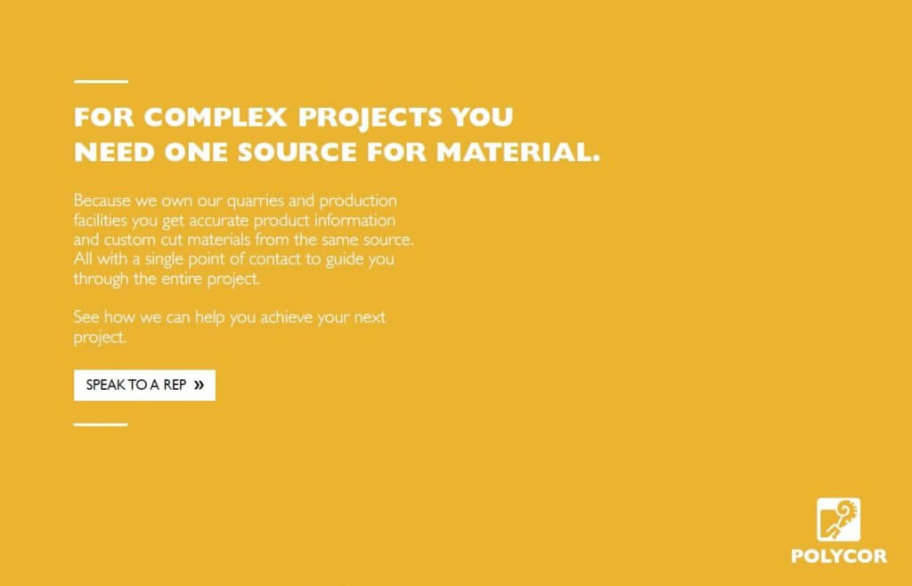
The Polycor case study ebook includes a CTA on the last page that prompts viewers to speak with a company representative if they are interested in working with Polycor on their own projects. If the viewers were interested in reading about this one specific project that Polycor was involved with, it makes sense that they might want to see how the company can work with them as well. Polycor has a specific audience in mind and this message and CTA are designed to prompt them to take action.
Speaking of CTAs…;-)
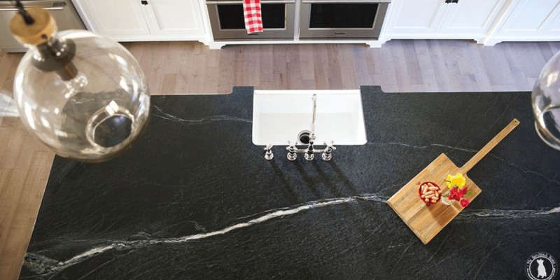
See how we used influencers and custom content to turn soapstone into a top seller.



Leave a Reply